OPINION: The polling numbers may surprise you
The rather famous “Hugo takes a selfie” video covering every day over eight years; you can even watch him answer a Q&A about it.)
CHANCES are you’ve seen this video, composed of a snapshots taken every day for eight, 10, 20 years. Strung together (sometimes set to music) they tell a universal story –of change.
A survey is a snapshot of public opinion. It tells us what people were thinking at a specific point in time, based on questions they were asked, usually with three possible replies: approve, disapprove, or no idea/no comment.
If you ask the same question on a regular basis, then each snapshot can be compared to those taken before, and after, that snapshot. Patterns or trends can be proposed, discussed, identified. And there’s more than one way to put forward the numbers.
In the image below, which looks at the satisfaction ratings of presidents according to the Social Weather Stations (the older of the two major polling firms in the country), you can look at satisfaction in “gross” or “net” terms. Gross is simply the number itself, which is a percentage of those who were surveyed. So, Corazon Aquino had 60% of people polled satisfied with her performance as president at the start of this chart, and at the end of her term the percentage who were satisfied was 38%. The number who were dissatisfied, and who had no opinion (or declined to state their opinion), would be two different percentages.


Or, you can simplify things –which seems to be the reason this method was invented, to avoid media people in a rush having to deal with three sets of figures—and take the percentage who are satisfied, and subtract the percentage who are dissatisfied, leaving you with a number that will be positive or negative. This is a “Net” rating, or result: and expressed as positive or negative number, and not a percentage. For example, in the same Cory Aquino-era figures quoted above, her results were +53 at the start and +7 at the end; at her lowest point, President Gloria Macapagal-Arroyo would have -53 as her net number in terms of public satisfaction.
Personally, I believe three numbers are more revealing than two. Those who agree or disagree with a question are two important percentages to keep track of; but equally interesting, especially over time, is the third percentage: those who, for one reason or another, have no opinion or who refuse to reveal what it is.
So as much as possible, I will refer to gross, and not net, numbers, although in reality it’s the main percentage most people care about. In the case of these two metrics, performance and trust, regularly reported by Pulse Asia (the younger of the two major polling firms) for example:


But whether you are SWS or Pulse, and however you prefer to look at how the percentages are reported, there are two things we look at in surveys (there’s lots of other things but please refer to the additional readings at the end if you want to dive deeper into the topic).
There is geography, divided in the polls according to the National Capital Region (NCR), Balance Luzon, the Visayas, and Mindanao.
And then there’s “we, the people,” broken down into the following classes: ABC, D, and E. In other countries, this is basically derived from categorizing according to income. This recent document from Nielsen Mediaresearch applies to the Czech Republic, puts it this way: Class A: “people with the highest socio-economic status,” Class B: “households with the second highest social-economic status”; Class C: “households with average estimated income per capita”; Class D “under average households”; Class E: “the poorest households”.
We do it differently in the Philippines. As blogger Marketman put it back in 2010 (referring to his experiences fifteen years before that!), “I have no idea who created this rating of one’s assets/income, but essentially I gather it is usually used for marketing and business purposes. It is important to note that it is NOT only based on income, but rather includes assets such as homes, vehicles, possessions, etc. Thus, at the ‘upper’ levels say A and B, the individuals counted as part of that level are not only among the higher income generators, but they have assets as well. For those in the ‘lower’ bands E, it is more likely that they not only have very low income levels, but typically will have few assets as well.” Marketman in turns refers us to the very clever blog, Alphanumeric, which put it more precisely: “Market/opinion researchers classify according through proxies of wealth/assets, rather than direct measure of income to segment the (consumer) market.” You will hear pollsters explain this in layman’s terms such as ABC own their own homes, and have vehicles, while D pay rent and commute, and E have nothing.
Jong-sung You, in an older volume, Democracy, Inequality and Corruption, puts forward these definitions and relative percentages of the popuation: A: “very rich,” B: “moderately rich,” C: “middle class,” D: “moderately poor,” and E: “very poor,” with ABC so small they have to be lumped together, comprising 7-11%, and D as the overwhelming majority in the country, comprising 58-73%, leaving E, comprising 18-32%.
Lets look at four snapshots. The first picture is the one taken on election day, when we went to the polls. The second picture is the starting point, so to speak, of the President when he assumed the presidency. The third snapshot is where the public stands on the administration’s “War on Drugs.” And the fourth snapshot is the President in terms of where he stands in terms of public satisfaction and trust.
So, for our first picture.
I. The President and the people as of election day
On May 9, when the country went to the precincts to vote, a picture emerged.

You should also see a great map from the good folks over at Wikipedia, showing the municipal level breakdown of the presidential race in 2016.
That picture, in turn, was made possible by millions of little pixels –people—who, taken together, explained the President’s victory.
On May 14, Mahar Mangahas, referring to the exit poll, observed that, “The voters made their choice for president a little later now. In the 2016 exit poll, 18 percent of those interviewed said they made their choice only on Election Day itself. Another 15 percent decided only during May 1-8, 12 percent did it in April, 8 percent in March, and 46 percent in February or earlier.” He boiled down candidate Duterte’s constituency as follows. In terms of geography, “Big wins for Duterte in Mindanao and Metro Manila” (although one report would say he won big in three regions: winning in all the provinces of the Davao, Soccsksargen, and ARMM regions); in terms of demographics, “The higher the class, the more the appeal of Duterte… The more the schooling, the more the appeal of Duterte… The younger the voter, the more the appeal of Duterte…” adding that he had much greater support among men than women, and that “Duterte was least supported by Catholics.”
The kommentariat (to which yours truly belongs) takes these numbers and tries to see patterns and make sense of them. For example, in a May 14 story on the exit poll, Professor Julio Teehankee put forward his view that the results were due to the “counter-elite challenging the old elite.” He said, ”The Duterte phenomenon is elite-driven. It is not the revolt of the poor. It is the angry protest of the new middle class: BPO workers, Uber drivers, and OFWs,” adding that,”They are the ones who are taxed the most and financing Daang Matuwid. They are working hard for their families and the country and yet they are the ones who suffer from lack of public service land and air traffic. Breakdown of peace and order[,] corruption, laglag-bala. The poor have their conditional cash transfer fund. The rich have their PPPS. What’s there for the middle class? They’ve been short changed!”
Of course everyone has a theory, and chances are you do, too. The percentages reported in the surveys help to prove, disprove, or simply explain, these theories.
Over time, a president starts to form two pictures: of his or her own journey up and down in terms of public opinion, and as chief executive in comparison to one’s predecessors and successors.
II. The President’s first measurements
First, the question of whether people are satisfied with the President in terms of his being president, was finally measured in September. This is the first time this is being measured, because, after all, in the last survey in June, he hadn’t even started exercising his powers yet.
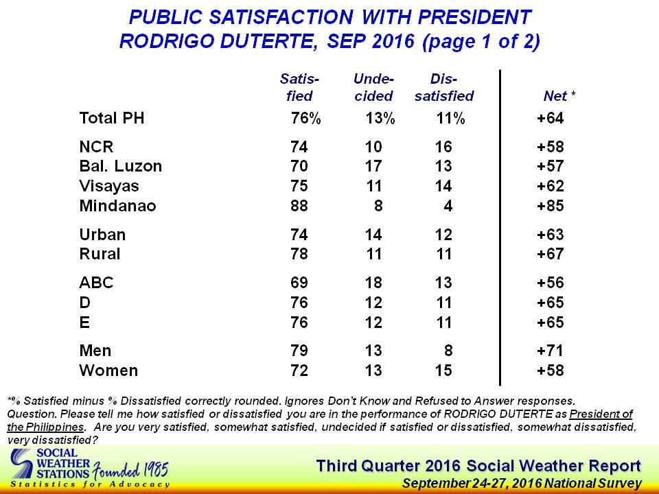

These are the percentages, then, that observers will look at to see what people think about the job the President is doing, moving forward. The percentages can fluctuate widely –and wildly—over time. The conventional wisdom is that satisfaction can only go down over time. Part of every administration’s narrative is to make it possible to defy and even disprove that conventional wisdom. Sometimes it happens. Sometimes it doesn’t.
As Mahar Mangahas pointed out on October 8 (VG means “Very Good,” according to a scale SWS uses), the people have a very good opinion of the job the President is doing, at a time in his term when previous presidents were also held in very good opinion by the people at this point in their terms.

The SWS in its own October 6 release said,
“For comparison, the initial net satisfaction ratings obtained by past presidents were: Pres. Cory C. Aquino, very good +53 (60% satisfied, 7% dissatisfied) in the May 2-June 6, 1986 survey; Pres. Fidel V. Ramos, very good +66 (70% satisfied, 4% dissatisfied) in the August 10-September 8, 1992 survey; Pres. Joseph E. Estrada, very good +60 (69% satisfied, 9% dissatisfied) in the September 11-29, 1998 survey; Pres. Gloria M. Macapagal-Arroyo, moderate +24 (42% satisfied, 18% dissatisfied) in the March 5-18, 2001 survey, after she was sworn into the presidency following the 2001 EDSA revolution, and moderate +12 (48% satisfied, 36% dissatisfied) in August 5-22, 2004, after winning the 2004 elections; and Pres. Benigno S. Aquino III, very good +60 (71% satisfied, 11% dissatisfied) in September 24-27, 2010…
“The SWS terminology for net satisfaction ratings is as follows: +70 and above, ‘excellent’; +50 to +69, ‘very good’; +30 to +49, ‘good’; +10 to +29, ‘moderate’, +9 to –9, ‘neutral’; –10 to –29, ‘poor’; –30 to –49, ‘bad’; –50 to –69, ‘very bad’; –70 and below, ‘execrable’.”
Putting it in perspective, according to Mangahas, “To me, President Duterte’s Very Good (VG) initial rating of… 76 percent satisfied, 11 percent dissatisfied, correctly rounded… is only normal. It is not unusual, since Presidents Cory Aquino, Fidel Ramos, Joseph Estrada, and Noynoy Aquino (P-Noy) also obtained VGs… initially. A few points difference from his net rating is immaterial…”
The only outlier, according to Mangahas, was GMA: “The one with an unusual initial rating was Gloria Arroyo, who got only Moderate ratings… both after succeeding Estrada on account of People Power II in 2001 and after winning her own election in 2004.”
So if everything is normal, so far, then what is important to bear in mind is that everything that happens from now on, will determine not only how the President is viewed according to his own initial standing but in comparison to those who came before: “The proper way to compare presidents is to use all the available data over time. Cory Aquino stayed VG until March 1987, a year after becoming president. Ramos stayed VG for two years. Estrada was VG for only a year. P-Noy averaged VG for three-and-a-half years.”
Which brings us to our third snapshot. It is of public opinion concerning the one thing the President seems to believe in most passionately of all: the “War on Drugs.”
III. The President’s “War on Drugs” and the people
The September SWS survey also included questions on the ongoing campaign against illegal drugs.
What is interesting is the range of possible answers. To simply things, you probably saw news reports saying 84% satisfied, 8% dissatisfied, with the “War on Drugs.” Some reports might even have added that another 8% are undecided.
But if you look at SWS’ own chart, it reports the percentages in finer detail.
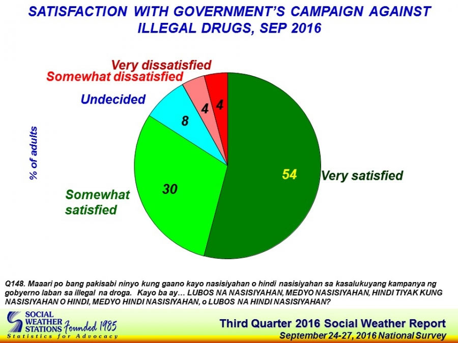
This comes out to 54% very satisfied, 30% somewhat satisfied, 8% undecided, 4% somewhat dissatisfied, and 4% very dissatisfied. A range of reactions which might give a mental picture very different from the same percentages when lumped together.
To me, the percentages, if you interpret them as enthusiasm on one end, and violent disagreement on the other, shows a much bigger grey area composed of the somewhat satisfied and the undecided, with the very satisfied having a slight majority, and yes, only 8% opposed.
Considering the time, energy, and resources devoted to the “War on Drugs,” and the intensity and frequency of official rhetoric promoting it as a core activity of the administration –indeed, the President himself—that 30% somewhat satisfied and the 8% undecided (which itself equals the currently opposed) should be a cause for worry in official circles. It is nowhere as overwhelming a percentage as the careless might think.
Combine it with the next question that was asked, and you have a truly astounding insight into not only what opinions people hold, but how they express them.

This comes out to 94% thinking it is important to keep illegal drug trade suspects alive and only 7% who think it is not important. Three things come to mind.
First, 71% believing it is very important to keep suspects alive can only be interpreted in one way: as a repudiation of the President. An outright rejection, considering how the President has personally, vocally, and repeatedly, justified casualties in the current campaign. People feel far more strongly, and firmly, about not wanting killings, than they do about the war in whose names killings are taking place.
Second of all, the 23% who think keeping suspects alive is “somewhat important,” which can be interpreted in many ways but most likely, it involves acceptance, to one extent or another, of both the possibility of “collateral damage” and the reality of shoot-outs. I point this out because the absolutely enormous –94%– percentage who think it is important to keep suspects alive, has a slightly ambivalent percentage within it, that itself is quite large.
And third, this slide means that those who are opposed to the current “War on Drugs” outnumber those who fairly strongly believe killing drug suspects is OK by a factor of 2:1.
Which, if you recall the last two articles on the “War on Drugs,” underscores why you often hear suggestions for the President to declare victory in the “War on Drugs” and start focusing on other things, or why even within official circles attempts were made to suggest the war would be moving on to a new phase. The President, in terms of the chief passion of his presidency, is seriously out of step with the sentiments of his people.
IV. In the President we trust
And finally, our fourth picture: the President himself. Now that’s he’s had the job for a quarter, is trusted or not, by the people?
Aside from satisfaction, the public was also polled about trust. As Mahar Mangahas pointed out last July 16:
“The survey question is about absolute trust, not relative trust. The SWS survey question about trust in a personality does not involve a comparison across personalities. It does not ask, “Who do you trust the most among persons A, B, C, and D?” as though asking for a single preference among four candidates in an election.”
On June 11, Mangahas had pointed out (referring to SWS’s own scale based on net results; the gross results for May 1-3 were 54% had much trust, 28% had little trust, in Duterte), “In survey history, Duterte is the only presidential candidate with a merely Moderate trust rating at election time.” He characterized trust in Duterte, as of the election, as “Moderate in the nation as a whole, and also Moderate in Metro Manila… and the Visayas… But it is Very Good in Mindanao…, and only Neutral in the Balance of Luzon… [He is] more trusted by men…than women … Older people trust Duterte less… [while] Duterte’s trust ratings rise with education…”
Here we have two snapshots, thanks to a handy-dandy SWS table showing the trust rating of the President before he was elected, as president-elect, and his first trust rating as president:

Mahar Mangahas’ observation on the above (as of last July) was “It was not until after winning the 2016 election that Mr. Duterte’s trust rating zoomed… those who trusted him by the end of June were more than twice as many as those who voted for him.” That’s snapshot one (June 24-27): 84% with much trust, 11% undecided, and 8% with little trust. Snapshot two is the September 24-27 snapshot, 83% with much trust, 9% undecided, and 8% with little trust. Essentially, things are unchanged. But the too-microscopic-to-matter-for-now shift, is still a shift; fewer are undecided, and more decided in the negative. You would have to have a double-digit shift, however, for the change to mean something.
If you look at the numbers in terms of geography, you will notice some slight shifts in the various regions, even though the overall numbers are basically unchanged as noted above.

NCR and Mindanao haven’t budged; in Balance Luzon, you will notice little trust went up 4%. It is in the Visayas, however, that the change is noticeable. Little Trust in the Visayas doubled, from 5% to 10% while Undecided went down almost by half, from 15% to 8%, while Much Trust increased by 3%, the only part of the country to actually register an increase. This hints at people making up their mind about the President (except in NCR where a tiny fraction of the undecided has actually increased).
Sticking to the geography, opinion according to the urban and rural divide is as follows:

Among the urban population, both indecision and little trust have grown 3% each from June; among the rural population, indecision has gone down nearly by half: much of it, it seems, going to much trust and a much smaller percentage going to little trust. So while overwhelmingly trusted in by both urban and rural dwellers, he has gained in the rural areas and lost a tiny bit of ground in urban areas.
In terms of “we, the people,” broken down into classes, and knowing the President did best in the ABC, and least in the D, the numbers are interesting, too.

The President retains his overwhelming support in ABC, but the percentage with little trust has grown tenfold: from a microscopic 1% in June to 10% in September; much of it seems to have come from those who were previously undecided, which shrank from 15% in June to 7% in September (reduced by half), together with a microscopic 1% of those with trust in June who seem to have transferred to little trust by September.
Class D, the biggest chunk of our population, after rallying around the newly-elected President between May and June, has an unchanged opinion about him in every respect. It is in Class E, the poorest of our fellow citizens, that you see a small but noticeable change. Those with little trust have more than doubled, from 6% in June to 13% in September, and again the shift is not from undecided to little trust (only 1% shifted from undecided to little trust), but from those with much trust straight to little trust: 4%.
Note that the rally-around-the-president-elect phenomenon can be seen in the chart above: the jump in every class from May to June.
Next we can divide society according to gender.
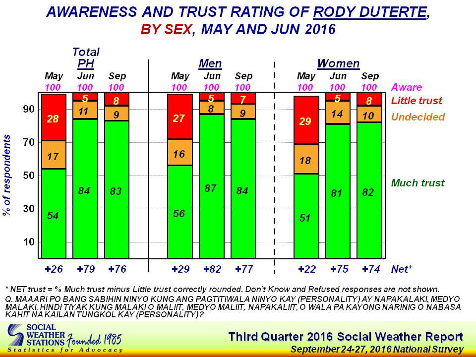
A very tiny shift from indecision to little trust, and a very small increase in little trust among men; a very tiny increase in much trust, a 4% decrease in indecision, and a slight increase in little trust, among women. Though even looking at these puny amounts, the President has gained more among women and lost among men, his main political gender demographic.
What about by age? We know that the President’s constituency includes younger people. He seems to be holding his own among these (18-24, 25-34, 35-44).

Though you can see some itsy-bitsy shifting. Among 18-24 year olds, those with little trust has tripled, from 2% in June to 7% in September, while indecision has slightly decreased. The President is most stable among 25-34 year olds; while among 35-44 year olds, his trust has microscopically increased, and any shift is from indecision (down 3%) to little trust (up 3%).
It is among the generation of parents, 45-54 years olds, that you see the biggest (relatively speaking of course) changes.
Little trust has more than doubled, from 4% to 10%, with indecision decreasing by 3%: the increase in little trust therefore including those who had formerly felt much trust.
Among citizens 55 and up, the President’s standing remains essentially unchanged, a tinge more trusted than last June.
In terms of education, the President continues to enjoy the overwhelming trust of his core constituencies of the more highly educated in our society. It is actually among the less-educated in our society that the President can be seen to be losing trust, however small.
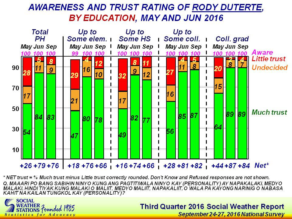
For those with up to some college education, the President’s trust has increased a small amount, while there are 3% fewer undecided; little trust has hardly increased at all. Among college graduates, trust in the President is overwhelming and remains practically fixed, with, again, a doubling of little trust but representing a tiny percentage.
However, for those with up to some elementary education, little trust has tripled, from 4% to 12% and indecision has gone down 6% which seems to have shifted in great part to little trust. For those with up to some High School education, little trust hit the low double digits, growing from 8% to 11%, with a similar growth in indecision from 9% to 12%. Trust in the high 70s of course is phenomenal by most standards, so these increases should be born in mind in comparison to that; but it is noteworthy that these are numbers in the 70s in comparison to the 80s the President enjoys among his core demographics.
A caveat on all these percentages. In terms of national numbers, the margin of error is usually pegged at plus or minus 3%. A layman’s interpretation of this usually goes, every percentage could be 3% higher, or 3% lower; and for numbers in different surveys to suggest something significant would require a difference of much more than 3%, say something in the range of 6%. For regional and class percentages, however, the percentages in the margin of error are even larger. Each survey will contain the margin of error for these categories, and you would actually have to consult the survey firm in question to find out what, exactly, they would consider significant from one survey to the next.
In other words there are very, very small movements involving very, very small percentages. What happens over the next two or three surveys will tell us if these were the first signs of trends, or temporary tiny blips.
It’s often said that the first survey in office of a President is the happiest time in an administration’s life. It is the culmination of the Triumphal Procession that began on election day. But a feature of the Roman Triumphs was a slave who would whisper to the conquering Caesar, “remember, you are mortal.”
That whispered warning inevitably comes to pass. Whether in the next survey or much later down the line, depends on one person –the President.
Additional readings:
The Open University has a three-party playlist on opinion polling, narrated by Professor Kevin McConway. Vincent Hutchings of the University of Michigan also explains the science behind random sampling in opinion polling.
Disclaimer:The views in this blog are those of the blogger and do not necessarily reflect the views of ABS-CBN Corp.